I have seen this phenomenon over and over. People get excited, happy about big letters that are human sized.
There is something appealing about standing side-by-side big type. We get silly and want to be part of that word. I have a couple of theories about that.
When the PanAm games came to Toronto last summer, I was fortunate enough to walk by when they were installing the big letters at Nathan Phillip Square. People were cheering, happy and curious. These letters stayed after the games as a new landmark of the city.
The letters are about 10 feet tall and rest on a podium. They are dimensional and lit. Basically they are a light box in the shape of uppercase letters with LED lights.
The font used is Azo Sans Bold by the Portuguese type designer Rui Abreu. A humanistic sans-serif font designed based on golden proportions. The reference about proportions sparked the first theory.
Theory one: We love big type because it remind us our body
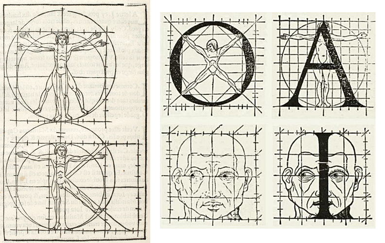
There are a few references about body proportions and typography. One of the ones I like the best is the study about proportions by Geofroy Tory in the book Champ Fleury (1529).
Tory designed a set of Roman letters of what he conceived as the “perfect alphabet” based on his studies of anatomy and geometry. In a clear reference to Da Vinci’s Vitruvian Man, the structure behind the grid used to draw letters was made using different body parts. Proportion manuals were popular in the Renaissance in an attempt to justify the classic thought by Protagoras who said, that “Man is the measure of all things”.
I think all typographers consciously or unconsciously have the reference of beautiful type proportions and the human body.
I found some other interesting samples such as The human alphabet by Peter Flötner (1534). Here there are no grid and the natural proportions of the body or bodies are the modules that define the shape of the letters.
Letters made out of the human body is a recurring theme in all kinds of illustrations and photos. Like this one from Howard Schatz, Body Alphabet (1997).
So, standing beside big type is a reflection of us. We love big type because is a narcissistic image: subconsciously we see in type our own body.
Robert Indiana’s LOVE sculpture, 6th Ave., Manhattan
Photo credit: mercinewyork.blogspot.com
Chip Kidd from TEDTalks, California 2012.
Screen capture from TED.com
Theory two: We love big type because it is a landmark
For theory number two size matters. Cities have identifiers, pieces of architecture that draw the skyline such as the Eiffel Tower in Paris or the Parthenon in Athens. But differently than ancient cities, modern cities have a different scale. Old cities where meant to be walked, new cities are transited by vehicles.
So in modern cities big signs, specially big type signs became a landmark too and the prime example is the Hollywood sign in California.
Photo from hollywoodsign.org
Photo: glitteratitours.com
In places like Los Angeles International Airport, big letters serve as the portal: announces that you’ve arrived.
Photo: imamsterdam.com
Landmark signs have become a branding exercise. Cities like Amsterdam have used their “I amsterdam” campaign to get postal ready photos at the different places where the sign is placed. That is what I like to call the “I was here” effect.
Bus stop by "mmmm" a collaboration between Emilio Alarcón, Alberto Alarcón, Ciro Márquez and Eva Salmerón. mmmm.tv
These big type branded signs work on two scales: we recognize them from far as a visual sign and as we approach them, they become human size: we can hug them, we can climb on them, they become material and photogenic, they become a play land. That playfulness make it a happy experience.
Photo from screen shoat of Google Image search for Toronto 3D sign.


