Growing up in Venezuela I have a few graphic design heroes. Nedo MF was one of them.

Nedo Mion Ferrario was born in Milan, Italy in 1926 and migrated to Venezuela in 1950. He is considered one of the pioneers of contemporary Venezuelan graphic design. Died in Caracas in 2001.
This post is a homage to him.

Letras sombra (shadow letters) was part of the Alfabetos imposibles (Impossible Alphabets), a series of typographic experiments made by Nedo M. F. in the 60's and 70's in Caracas, Venezuela.
For this alphabet he used Letraset’s Compacta typeface in uppercase, and projected one side of the typeface at an angle as a solid bar, showing the reversed shape of the same letter at the other end.
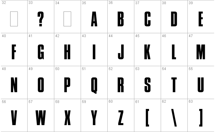
Compacta (Fred Lambert, 1963) is a predecessor of the popular Impact.
In Letras sombra Nedo forced the traditional concept of the typeface to a geometric extreme, flipping the perception of positive and negative shapes, light and shadow, filled and empty, suggesting at the same time two and three dimensions in denial of perspective.

Reversion. Part of Nedo's experiments with impossible geometric shapes
For Nedo his design expression became graphic language. As can be seen in this case, this typographic treatment evolved into a completely new typeface, showing his ability to transform images into symbols.

The Alfabetos Imposibles series was conceived as a graphic essay and was the result of several artistic collaborations with Gerd Leufert. These visual perception experiments were published and exhibited under the name of Imposibilia.
The design of 60 of his alphabets was published for the first time in the limited edition book Letromaquia, 1972, and later exhibited at the Museo de Bellas Artes, Caracas. These alphabets were the answer to his effort to look at typefaces in an intuitive and innovative way. There was no vanity, nor artistic-conscious intention –Nedo said in the prologue–, and added: It was inevitably insolent. It was directed against the 'worn-out recipes' referred from abroad.
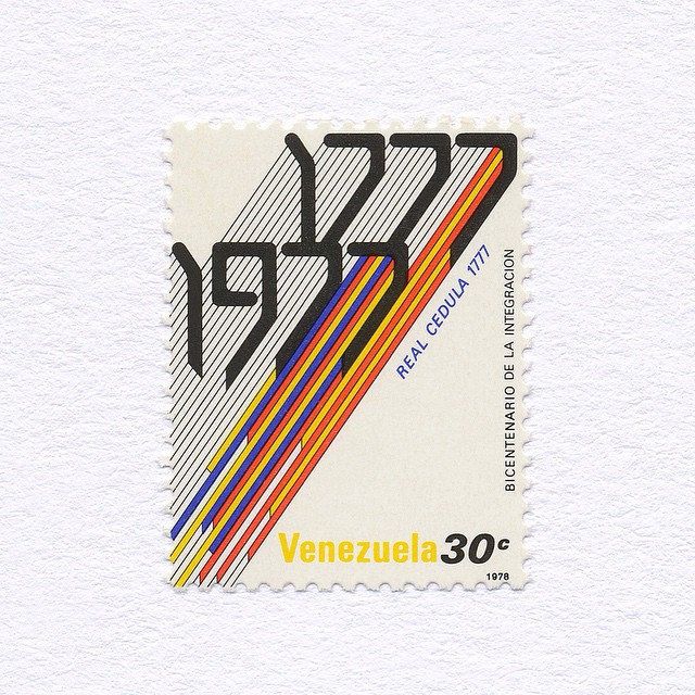
Some of those alphabets were reprinted in experimental magazines, and featured in postal stamp series published between 1974 and 1979, and also used as display for titles in page layouts, book covers and branding.
